THE PSYCHOLOGY OF COLOR: HOW PAINT INFLUENCES YOUR MOOD AND PRODUCTIVITY

You may not know this, but interior design and decorating have a lot in common with psychology. Colors have an impact on our emotions and can determine how productive we are in our daily life. Choosing the right paint for spaces in your home is important because it can stir up specific feelings and set the room's tone. That’s why understanding the characteristics of colors is important. There are several things to consider when choosing the best paint for your room, so I’m going to break this down for you and help you make the right choice. This post is about the psychology of paint colors and how they influence your mood and productivity.
“I may earn a small commission for affiliate links in this post at no extra cost to you. Please read my privacy policy and privacy page for more information..”
Understanding The Psychology Of Different Colors
Here, we’ll go over the tones of paint and what emotions they are associated with.
Warm Tones: The characteristics of these shades are passion, energizing, friendliness, warmth, comfort, and happiness. They are often associated with the elements like sunlight, fire, and earth and create a cozy and inviting atmosphere. These would be shades of red, orange and yellow.
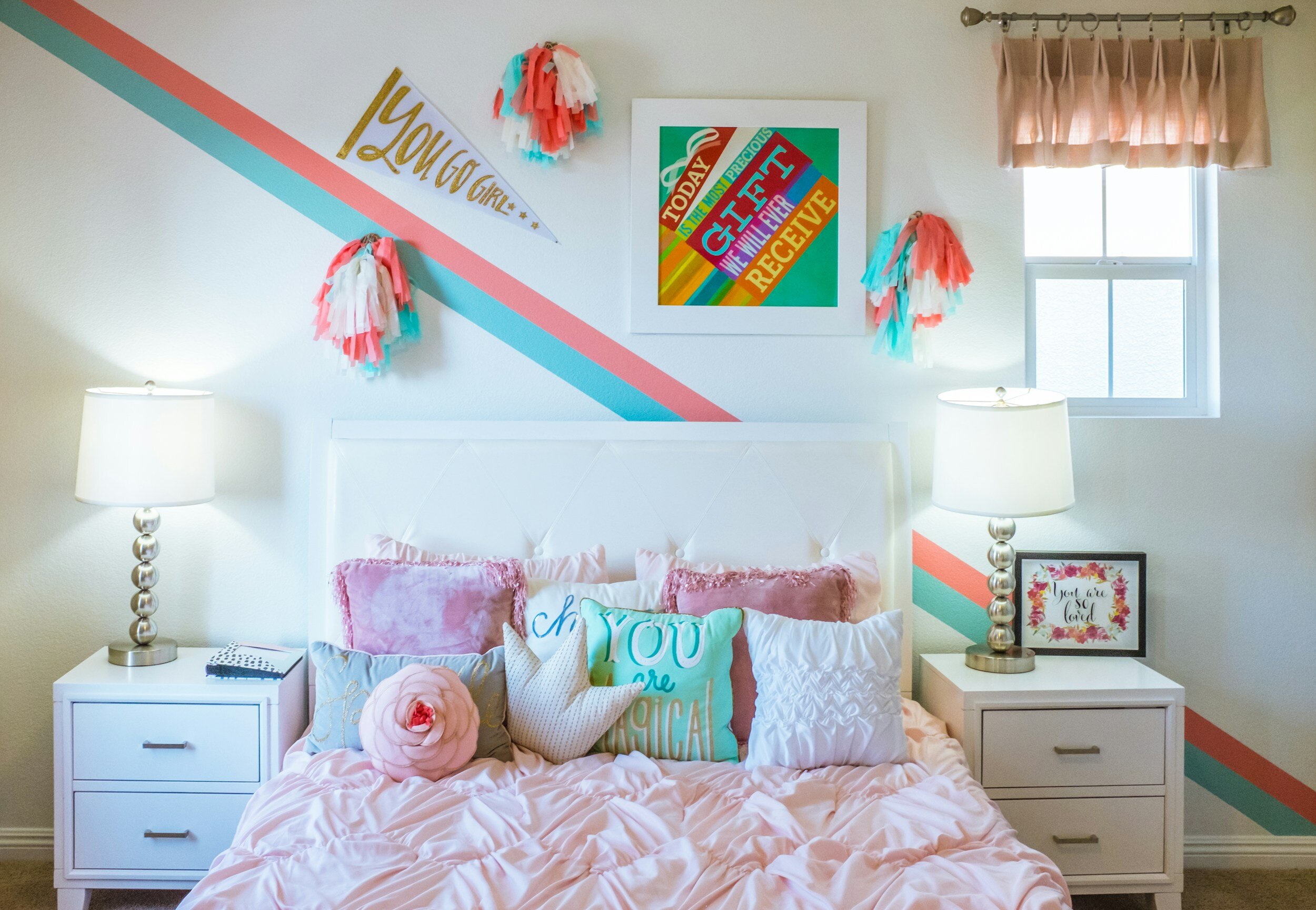
Red: This is a powerful and emotionally intense color. It is associated with passion, love, energy and warmth. It can create a sense of excitement and would be great for an accent interior wall or a piece of furniture.
Orange: Orange combines the energy from red, and the happiness yellow makes you feel. It represents warmth, enthusiasm, and creativity. It is definitely an attention-grabbing color that would give feelings of joy and excitement to any room.
Yellow: As you know, yellow reminds us of sunshine, happiness, and positivity. It’s uplifting and can create warmth, cheerfulness, and optimism. I don’t know about you, but I know I am happier and more positive on a sunny day than on a dull, depressing rainy day.
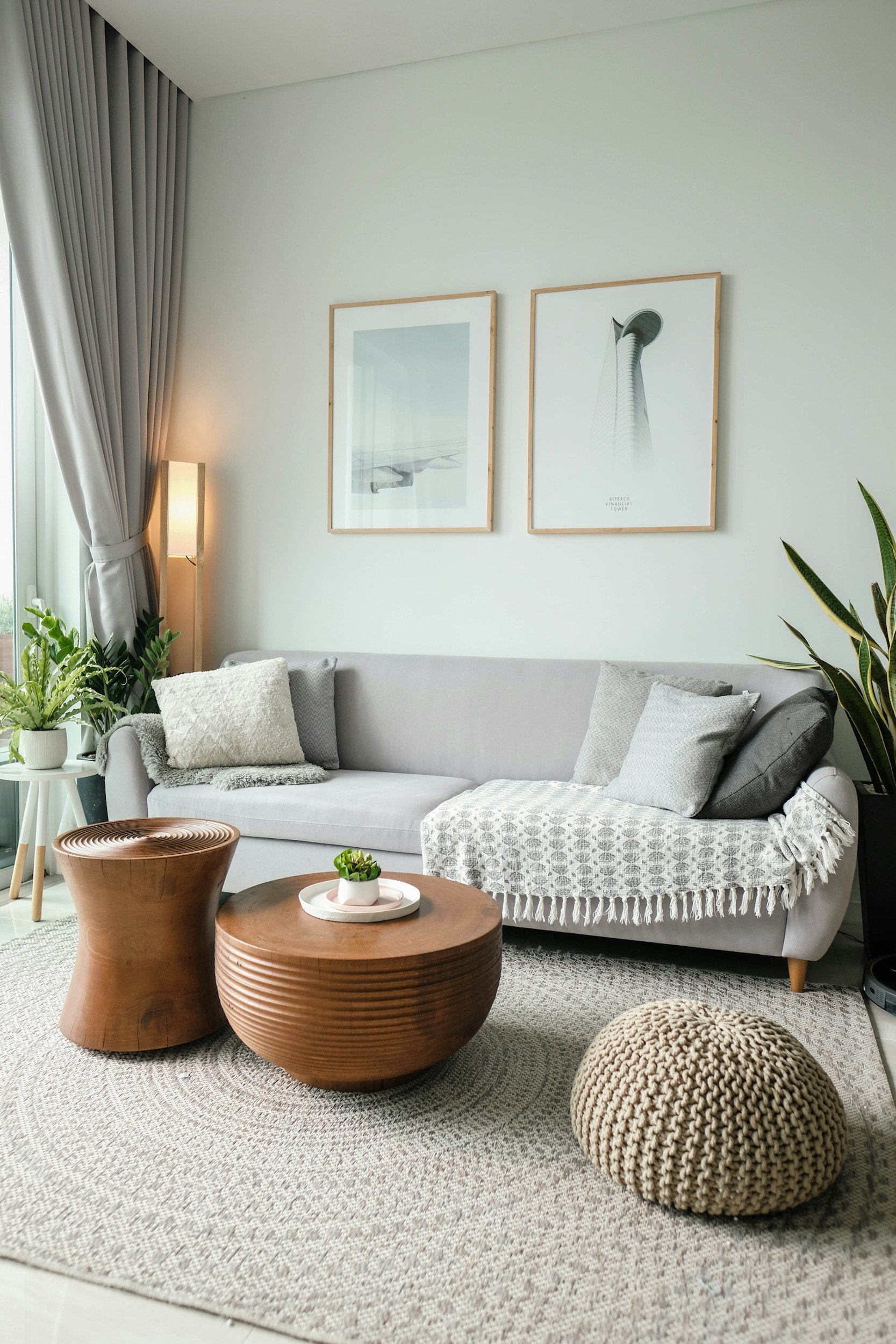
Cool Tones: These tones bring on a sense of relaxation, balance, nature-loving, luxury, and good mental health in general. Cool tones are associated with the elements like water, sky, and nature. These would be green, blue, and purple.
Green: Of course, green reminds us of nature, but it also is associated with growing and starting over. It symbolizes balance and freshness and is known to reduce stress.
Blue: This is a calming and peaceful color. It is associated with the sky and ocean and represents stability and tranquility. I live in the South near the ocean and whenever I have a bad day or just need a pick-me-up, I head to the beach and watch the waves. It makes everything better.
Purple: Purple has been known as a color of mystery; think of a magician’s cloak. It is also associated with luxury and sophistication. It has a combination of calming blue and energizing red.
Neutral Tones: These tones give feelings of serenity and peacefulness. Colors like gray, black, white, and beige. Cool neutrals like grays, blues, and greens give a clean and sophisticated feel and are often a part of modern and minimalist decor.
Choosing Paint Colors For Specific Rooms
Now that you have an understanding of the moods of the colors, we can go over how to pick your room color based on the function and feeling you want it to have.
Consider incorporating red in spaces where you want to stimulate conversation or add a bold focal point like a piece of art. You can add a red accent chair to your living room, red chair covers to your dining chairs, or paint an accent wall in a bedroom.
Use orange in spaces where you want to encourage social interaction and creativity. It can be an excellent choice for kitchens, playrooms, or home offices. You can add an orange rug to brighten your kitchen or a fun orange sofa to your playroom or office.
Yellow is known to stimulate mental activity and promote a sense of clarity. Yellow works well in spaces where you want to encourage creativity and a positive atmosphere. It can be used in kitchens, dining areas, home offices or as an accent color in a bedroom. Light and flowing yellow curtains would be an easy way to add positivity to any of these areas.
Green is versatile and can be used in various spaces. Light greens create a serene atmosphere, while deep greens can add richness to a room. Consider using green in bedrooms and living rooms or as an accent color in kitchens. This soft sage green comforter set would make it easy to drift off to sleep.
Blue is also versatile and works well in bedrooms, bathrooms, and living areas where a sense of relaxation is desired. Light blues can create an airy feel, while deeper blues can add sophistication.
Purple can be used in bedrooms and dining areas or as an accent color to create a sense of elegance. Lighter shades can be calming, while darker shades add a touch of luxury.
Hey there reader! While you’re here, why don’t you…
Join Our Mailing List:
Incorporating Accent Colors Into Your Space
Choose accent colors that match your personality and contribute to a positive living space. Consider accent colors inspired by nature, such as earthy greens or serene blues. These hues can strengthen a connection with the outdoors and contribute to a sense of well-being. The right accent shades can positively influence your everyday routine when combined with appropriate lighting.
These accent colors set the scene for a quiet and tranquil sleeping space. Shades of blue and green are known to promote relaxation and improve the quality of sleep. They would also be good in spaces dedicated to focus and concentration, such as your home office. Blues and greens can enhance your mental status while maintaining a calm, stress-free work area. Consider changing your bedding to these colors or adding a chair to your room to bring in the relaxing tones.
Paint Colors and Your Wellness
The colors you surround yourself with can impact your mental and physical well-being.
Consider warm-toned accent lights for cozy evenings and cooler tones for bright, productive mornings. Designate spaces within your home, such as a reading nook, with soothing accent colors to create personal places that contribute to stress reduction and mental rejuvenation.
In the world of interior design, color is a powerful tool that goes beyond aesthetics. By incorporating accent paint colors inspired by the principles of psychology, you have the opportunity to shape the mood, productivity, and overall well-being of your living spaces. Whether you're aiming for a vibrant and energetic ambiance or a calm and focused one, the tones you choose can truly affect your world. Use this new knowledge of the psychology of colors in your home, and watch it become the picture of a healthier, happier lifestyle.
*Below are some home decor shopping links you might enjoy. Let me know if you are looking for something specific, and I will gladly find some options for you.
https://mave.ly/designs-the-space-shop
**Be sure to stay up to date with decorating trends, tips, and inspiration by signing up for our email newsletters. Reach out to me if you have any questions or if you’d like to schedule a quick complimentary call to discuss how I can help with your design and decorating needs.
This post was about the psychology of colors and how paint can influence your mood and productivity.
written by:

Pam Wichlei
Founder & CEO
Topics:
Design Tips
How-To & DIYs
Design Inspiration
Let’s Talk
Work With Us

Visit our studio page to learn more about our services and see some of our past work!