TIPS FOR BLENDING 2024 PAINT TRENDS INTO YOUR HOME DECOR.

One of my favorite things about interior design is the release of new paint colors every year. Many of the paint manufacturers come out with what they think will be the trend for the year. I will tell you about Sherwin Williams Colormix Forecast for 2024 and how you can incorporate these colors into your home decor. This post is about integrating color trends into your home decor.
“I may earn a small commission for affiliate links in this post at no extra cost to you. Please read my privacy policy and privacy page for more information. As an Amazon Associate, I earn from qualifying purchases.”
Blues and Greens
Georgian Bay SW 6509--Depending on the effect you want it to have, this vibrant blue can be used in a number of ways. If you want a coastal vibe for your room, you can use this paint for the walls and/or ceiling. Add whites, beiges, and light blues to the room in curtains, pillows, artwork, rugs and accessories. Bring in some plants, shells, and driftwood to complete the look.
Pair it with contrasting accents if you want to make a bold statement using Georgian Bay paint. For example, bring vibrant yellows, oranges, and reds in with furniture, artwork, and accessories. These striking colors will go well with the calming blue Georgian Bay.
Billiard Green SW 0016-This is a dark green with a hint of teal that will give an elegant feeling to a room. You could create a cozy atmosphere by using this paint as your main wall color and bring in some richer tones like brown, burgundy, or purple in comfy blankets and furniture. Textures like velvet and faux fur would be perfect for this room. If you don’t want to paint all of the walls, you could just paint one wall or the ceiling or paint a piece of furniture as a bold focal point.
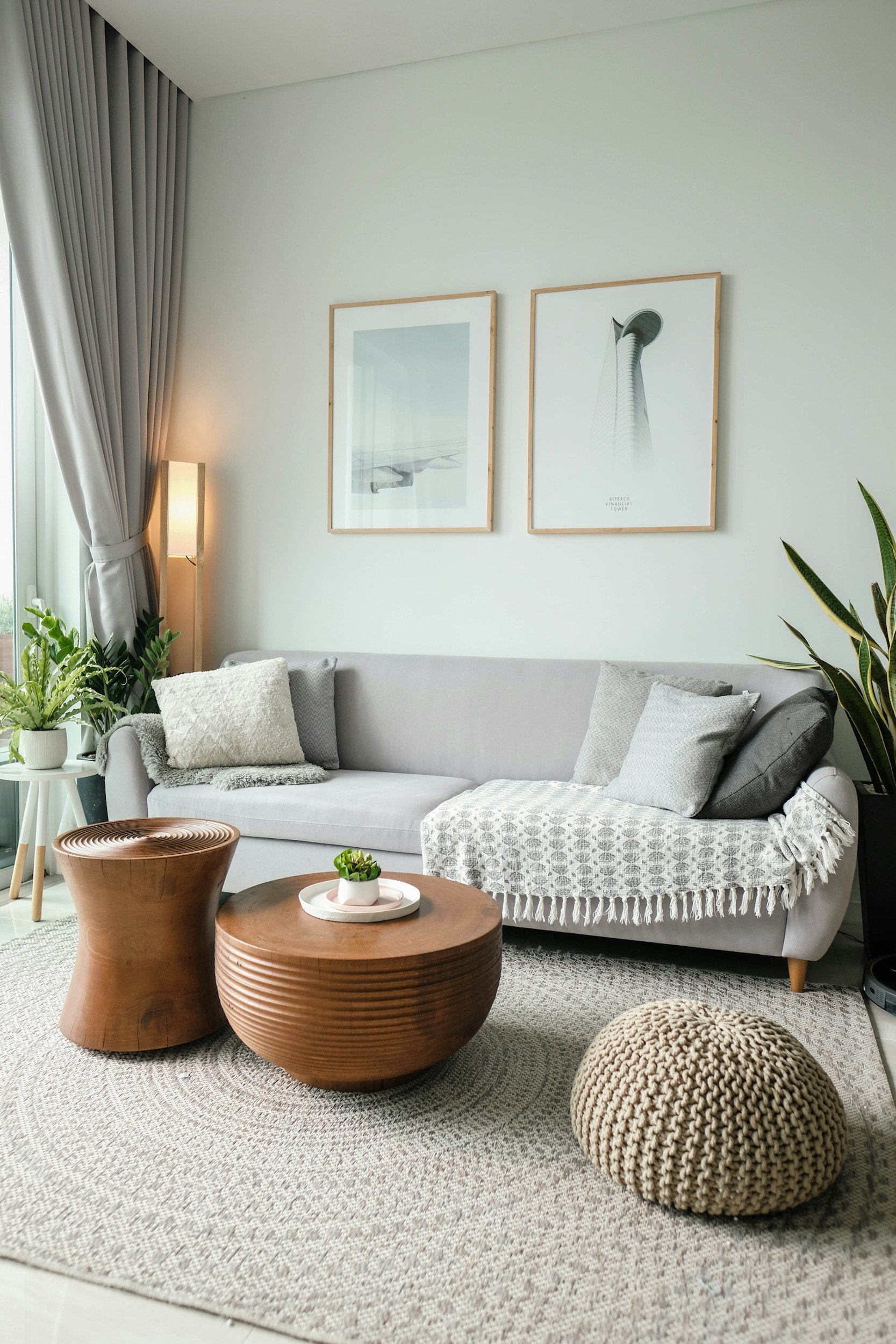
Stardew SW 9138-This blue gray paint is a mix of warm and cool tones. I think it would make a beautiful kitchen. You could use this paint on the walls or the cabinets. Bring in beige, brown and shades of light blue in the countertop, backsplash, accessories, and rugs and tie it all together.
Reds and Purples
Fireweed SW 6328-This bold reddish-purple color will add a lot of personality and warmth to your space. This paint would create a vibrant focal point by painting an accent wall in your dining room or living room. Combine neutral tones like whites, creams, grays, and beiges in accessories and artwork for a sophisticated look. You could also paint your pantry door to add a pop of color to a neutral kitchen. Use Fireweed on your front door and make a bold statement while creating a welcoming entryway for your guests.
Rhapsody Lilac SW 9138-This is a soft and soothing shade of lilac that will bring a sense of tranquillity and elegance to your home. This shade of purple would be perfect for a bedroom or bathroom and is sure to help you relax. Maybe try painting an accent wall in the dining room for a bit of interest without being overwhelming. This soft purple would go well with whites, creams, grays and light beiges.
Sashay Sand SW 6051-I love this new paint color. Its soft, earthy tones create a warm and inviting feeling. Sashay Sand would be great in any room as the primary wall color or accent wall to add depth to the room. For a nice contrast to neutral walls, paint the baseboards and trim Sashay Sand. Paint the ceiling in a room for an airy feeling. Combine Sashay Sand with bold shades like deep greens, blues, and burgundy.
Hey there reader! While you’re here, why don’t you…
Join Our Mailing List:
Bold and Dark Shades
Sealskin SW 7675-This rich color is perfect if you like browns with a little tint of gray. It would look good in a well-lit living room, dining room, or bedroom. This color would add a touch of drama to kitchen island cabinets, bathroom vanity cabinets, or a piece of furniture. Sealskin would be beautiful in a faux-finish technique to add character to any wall. Complementary tones include lighter grays, creams, soft blues, and muted greens. You can add these colors to your decor with artwork, throw pillows, curtains, and even furniture.
Gale Force SW 7605-This is a dark, moody blue paint color that would add a look of sophistication and depth to your home decor. Even the name Gale Force gives off a dramatic vibe. It would be nice for a focal point by painting an accent wall. You could definitely dress up your bookcases by painting the shelves or back of the bookcase this bold color. Exposed brick on a fireplace or wall panelling would definitely be more appealing with dark blue paint on it. Add accessories, artwork, and furniture in soft neutrals, warm whites, and light grays to complement this deep blue paint.
Rock Bottom SW 7062-Rock Bottom is an interesting color as it is a dark gray but has brown and green hues to it. This combination is sophisticated and elegant but with a sense of warmth. It would be a nice change from white baseboards, crown molding, and trim work. Paint your entryway walls in Rock Bottom and create a welcoming foyer. Be sure to add statement lighting like a chandelier, lamps or wall sconces and decorative accents, a foyer table, and candles to bring it together without overpowering the space. To enhance the richness of this paint add shades of silver, grays, white, and cream.
Soothing and Soft Hues
Silver Strand SW 7057- If you like light and airy colors, you will love this one. It has tints of gray and green and gives a calming and relaxing vibe. For that reason, it would be perfect for bedroom or bathroom walls and or ceilings. Cream, muted green, light gray bedding and curtains would go nicely with the light gray paint. If you have a dark room, consider painting a furniture piece Silver Strand to add a soft tone to the room. Bring in similar neutral shades like white, cream, and light gray. If you want to add a coastal feel to a room, this paint is a great choice. You can add some natural materials like plants, beachy decor, artwork and furniture to have your own bit of paradise.
Skyline Steel SW 1015-This stone gray color will never go out of style. If you like modern or minimalistic interior design styles, you will like this paint. Its subtle and neutral tone can be used anywhere to complement the clean, sleek lines of modern furniture and decor. If you’re tired of white ceilings, paint them Skyline Steel for continuity and airiness. It will complement the wall color and enhance the room's overall appearance. Pick curtains, rugs, and artwork that have similar neutral colors like warm whites and light beiges.
Snowbound SW 7004-If you like white and gray together, this is your color. It is a cool-toned white that works well with other colors with shades of grays. If your walls are deep blue, green or gray, Snowbound is an excellent switch up from white for your trim, molding, ceilings and doors. It will create a nice contrast with the walls and look clean and classic. If you like the contemporary design style, Snowbound works well with minimal decor and metallic accents.
Remember to experiment with paint samples to see how the color will look before painting the entire room. Test the paint in different lighting, as it will look different in natural and artificial light. Test it on several walls because it will appear different there as well.
I hope this blog post that was all about TIPS ON HOW TO INCORPORATE SHERWIN WILLIAMS’ 2024 PAINT COLOR TRENDS INTO YOUR HOME DECOR has inspired you to pick the colors you like and introduce them into your home decor. Stay tuned for more blog posts on trends in interior design and paint. Contact me if you would like to set up a consultation.
written by:

Pam Wichlei
Founder & CEO
Topics:
Design Tips
How-To & DIYs
Design Inspiration
Let’s Talk
Work With Us

Visit our studio page to learn more about our services and see some of our past work!